Serração Santa Luzia
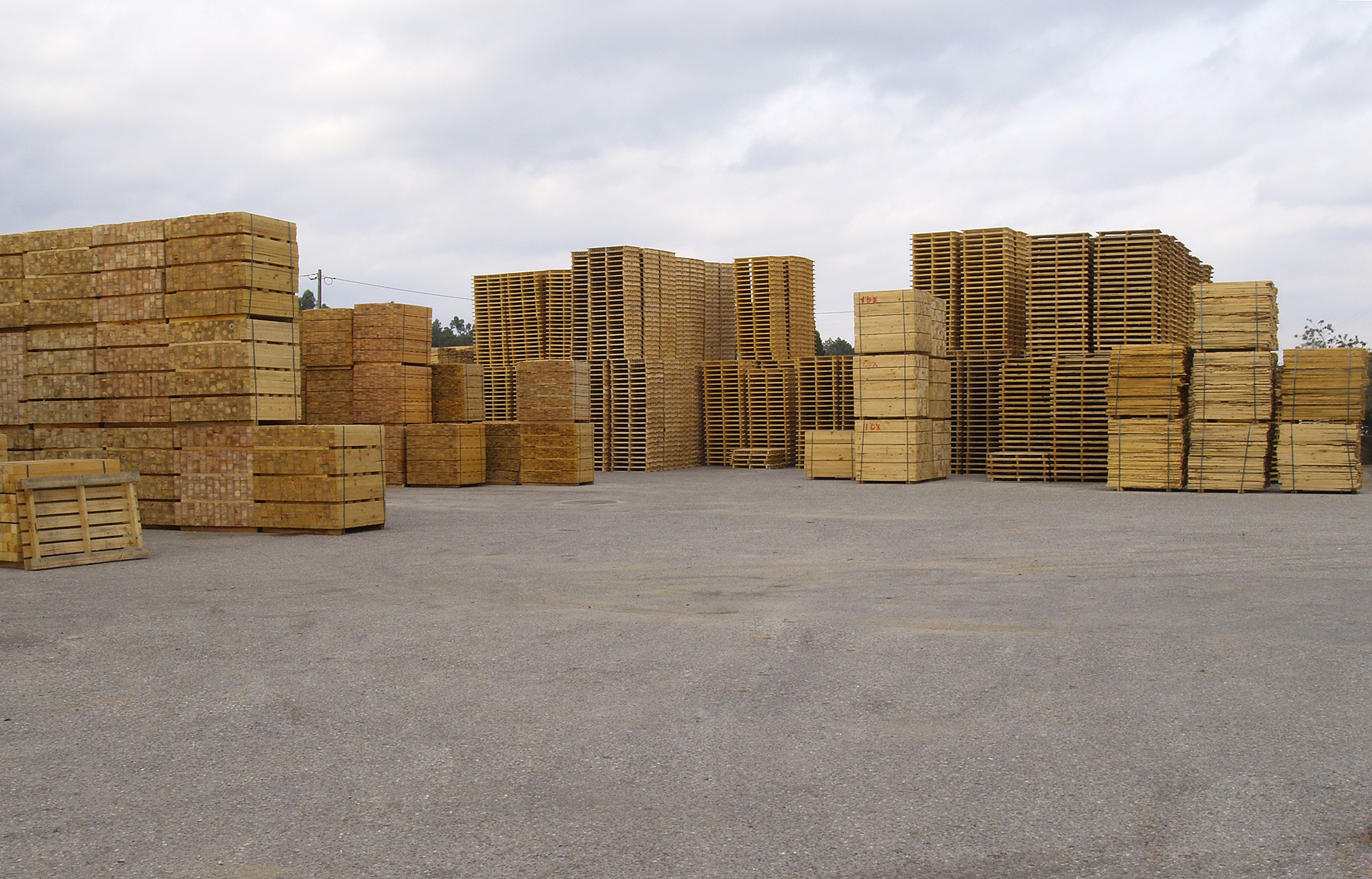
Serração Santa Luzia is a sawmill company based in St. Luzia, a small town in the centre of Portugal.
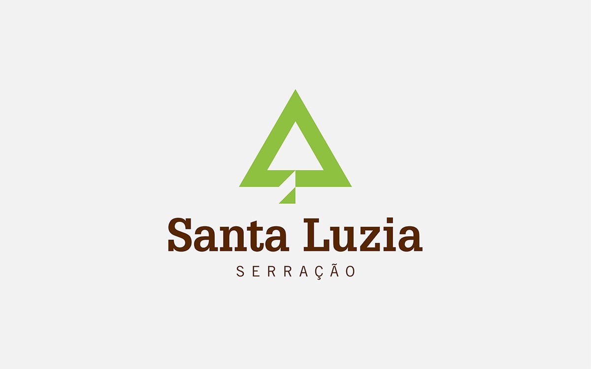
In 2011 the sawmill decided to evolve and modernize itself and decided to redesign the companies’ identity. Pine trees are the companies’ main feedstock. Therefore, we used the triangle as a metaphor to represent the treetop of pine trees and paired it with a sturdy slab serif typeface for the logotype.
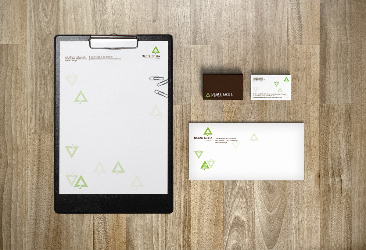
The brand system (patterns made with the brand) also reflects the company’s approach to cutting trees, aiming for sustainable reforestation techniques.
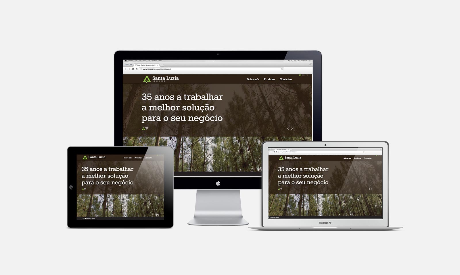
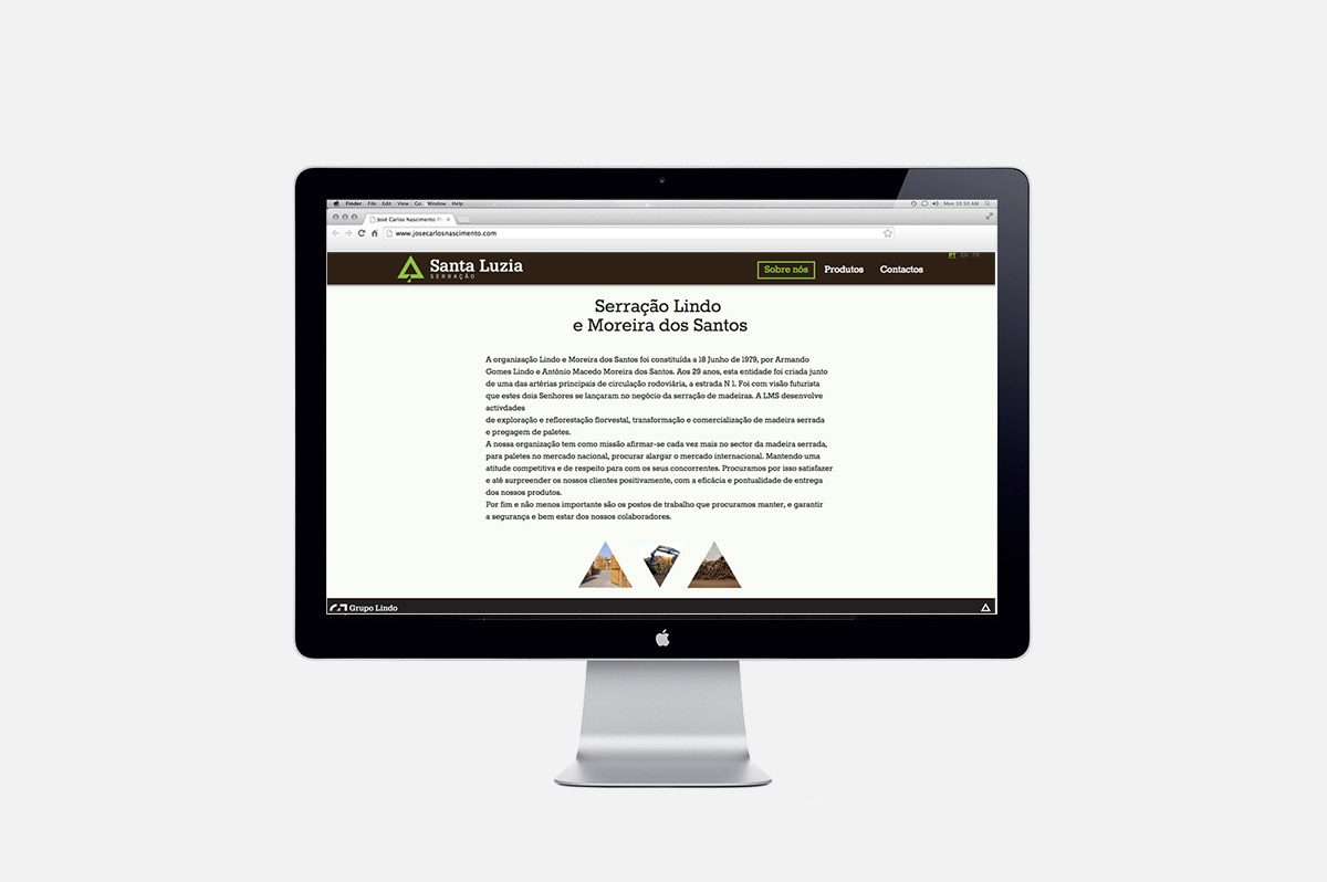
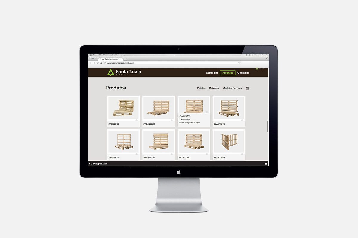
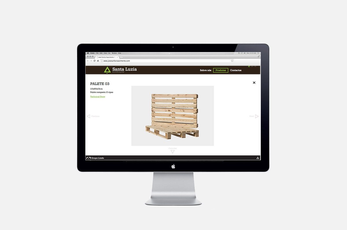
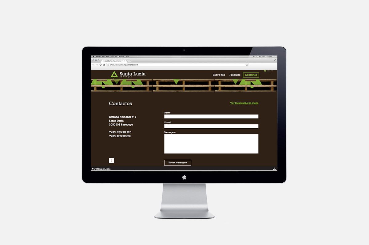
Along with the identity, the website was designed to promote the company and showcase there products.