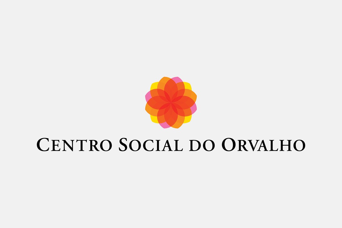
Social Center of Orvalho
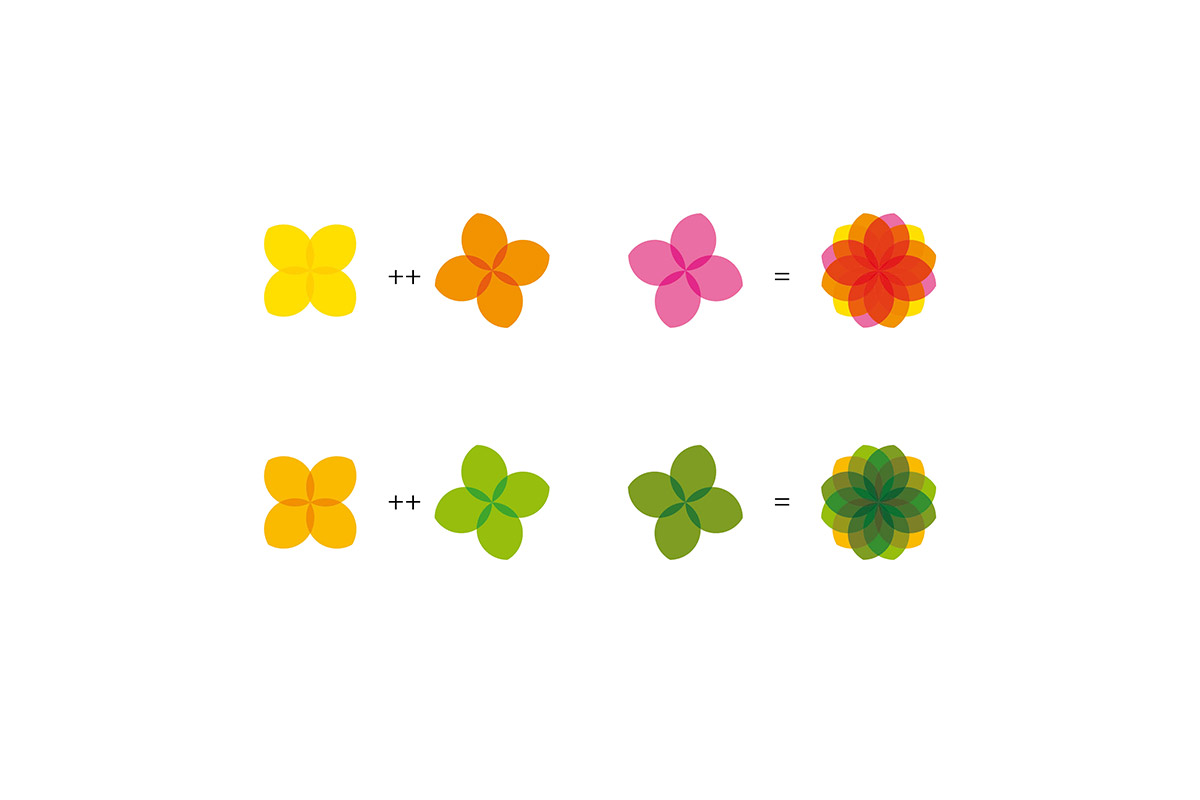
The identity for the Social Center of Orvalho was designed based on the symbol of “Flower of Life”. The existence of this symbology is over 6,000 years old. Initially seen in the ceillings of Osiris Temple at Abydos, Egypt.
This symbol forms a pattern that underlies the creation of life, all the molecules and cells of the human body know this pattern.
However the geometric design in a circular shape also represents the sun, which is light, therefor life, the inner spirit of every being.
The brand wants to convey to the target audience the idea of a dynamic, competent and pleasant space, a place to prolong a healthy life.
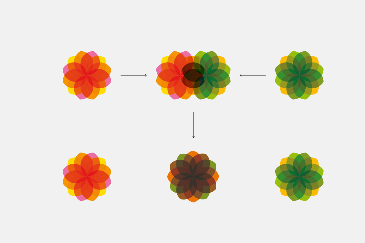
The main brand is composed of three deferent sets of colour palettes, with three overlapping warm colours, referring to the sun.
For the merchandising were the identity is applied, a secondary colours palette was created. The use of both palettes allows us to get 3 different chromatic universes, making a more dynamic brand without losing the identity of the institute.
Project designed at FBA.